Buttons, Icons & Fields
Primary button settings, such as Add to card, Checkout, Create account, Login, among others.
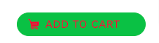
Button text color
Color of the text on a main button, in the example, it is set to red:
Button text hover color
Text color when passing the mouse over a primary button.
Button text active color
Text color of a main button when it is selected.
Button background
Background of a main button, in the example, is set to green:

Button background hover
Background color of a main button when hovering the mouse over it.
Button background active
Background color of a main button when it is clicked.
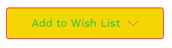
Button text color
Color of the text on a secondary button, in the example, it is set to green:
Button text hover color
Text color when passing the mouse over a secondary button.
Button text active color
Text color of a child button when it is selected (clicked).
Button background
Background of a secondary button, in the example, is set to yellow:

Button border
Color of the border of a secondary button, in the example, it is set to red:

Button border hover
The color of the border of a secondary button when the mouse is hovered over it.
Button border active
Color of the border of a child button when it is selected, clicked.
Button text color
Text color of a disabled button.
Button background
Background color of a disabled button.
Button border
Color of the border of a disabled button.
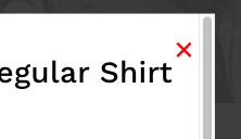
Icon
Color of icons: button to close pop-up windows, paging icons, social network sharing icons on product and blog pages, among others.
In the example, red is set:

Icon hover
Alternate color of icons when hovering the mouse over buttons to close pop-up windows, paging icons, social network sharing icons on product and blog pages, among others.
In the example, it is set to blue and the mouse is over the printer icon:

Star review icon (full)
Color of the completed stars, in the example, is set to green:
Star review icon (empty)
Color of uncompleted stars, in the example, is set to yellow:
Label text color
Color of field labels in a form, in the example shown above, is set to black:
Form text color
Form text color, in the example shown above, is set to pink:

Uncompleted field text color
Text color of the fields that have not been filled in, in the example shown above, is set to blue:
"Enter your text", in this case, is the help text that disappears when the user starts typing, that is why the field is shown as not completed:

Uncompleted field background color
Background color of the field that has not been filled in, in the example shown above, is set to light gray:
In this case, "Enter your text", is the help text that disappears when the user starts typing, that is why the field is shown as not completed.
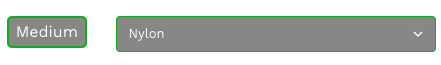
Uncompleted field border color
Border color of the fields that have not been completed, in the example shown above, is set to yellow:
"Enter your text", in this case, is the help text that disappears when the user starts typing, that is why the field is shown as not completed:

Completed field text color
Text color of the fields that have been filled in, in the example shown above, is set to white:
Completed field background color
Background color of the fields that have been completed, in the example shown above, is set to dark gray:
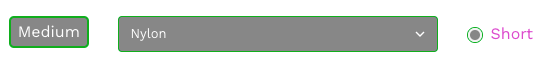
Complete field border color
Border color of the fields that have been completed, in the example shown above, is set to green:

Field border active
Border of the field in which the user is positioned, in the example shown above, is set to red: